Strategy. Innovation. Brand.
Linearly Nonlinear

Take two!
If taking one vitamin pill per day is good for you, then taking two pills per day should be better, shouldn’t it? If two is better than one, then three should be better than two.
If we continue to follow this logic, we’ll soon be taking a whole bottle of vitamins every day. Why don’t we? Because of two limiting factors:
- Diminishing returns – each additional pill gives less benefit than the previous pill;
- Negative returns – beyond a certain point, each additional pill makes things worse.
It’s easy to figure this out for simple items like vitamin pills. But, in more complex decisions, we tend to have a linear bias. If there’s a linear relationship between two variables, we assume that the line continues forever.
Let’s take schools, for instance. In the United States, we’re obsessed with measuring student performance in schools and tracking it over time. We create performance tables to identify the schools that provide the best education and those that provide the worst.
You may notice that small schools are often at the top of the charts. You might conclude that school size and performance are linearly related. It might be wise to build more small schools and fewer large schools. Unfortunately, you’re suffering from linear bias.
To find the error, just look at the bottom of the performance charts. You’ll probably find many small schools there as well. Small schools dominate the top and bottom of the chart; large schools tend to fall into the middle range.
What’s going on? It’s the variability of small samples. If you flip a coin ten times, you might get eight tails. If you flip the same coin a thousand times, it’s very unlikely that you’ll get 800 tails. With larger samples, things tend to even out.
The same happens in schools. Larger schools have larger samples of students and their performance tends to even out. Performance in small schools is much more variable, both upward and downward. The relationship between school size and performance is a curve, not a straight line.
For the same reason, I was briefly (but gloriously) the most accurate shooter on my high school basketball team. After three games, I had taken only one shot, but I made it! In other words, I made 100% of my shots – the top of the performance chart. But what if I had missed that one shot? My accuracy would have fallen to 0%, the very bottom of the chart. With one flip of my wrist, I could have gone from best to worst. That’s the volatile variability of small samples.
A straight line is the simplest relationship one can find between two variables. I generally believe that simpler is better. But many relationships simply aren’t simple. They change in nonlinear ways. By trying to make them linear, we over-simplify and run the risk of significant mistakes. Here are two:
- If an hour of exercise is good for you, then two hours must be better. The assumption is that more exercise equals better health. It’s a linear relationship. But is it really? I have friends who exercise for hours a day. I worry for their health (and sanity).
- If cutting taxes by 10% is good for the economy, then cutting taxes by 20% must be better. We assume that lower taxes stimulate the economy in a linear fashion. But, at some point, we must get negative returns.
What’s the bottom line here? If someone argues that the relationship between two variables is a straight line, take it with a grain of salt. And if one grain of salt is good for you, then two grains should be better. And if two grains are better, then three grains … well, you get the picture.
(I adapted the school example from Jordan Ellenberg’s excellent new book, How Not To Be Wrong: The Power Of Mathematical Thinking).
Survivorship Bias

Protect the engines.
Are humans fundamentally biased in our thinking? Sure, we are. In fact, I’ve written about the 17 biases that consistently crop up in our thinking. (See here, here, here, and here). We’re biased because we follow rules of thumb (known as heuristics) that are right most of the time. But when they’re wrong, they’re wrong in consistent ways. It helps to be aware of our biases so we can correct for them.
I thought my list of 17 provided a complete accounting of our biases. But I was wrong. In fact, I was biased. I wanted a complete list so I jumped to the conclusion that my list was complete. I made a subtle mistake and assumed that I didn’t need to search any further. But, in fact, I should have continued my search.
The latest example I’ve discovered is called the survivorship bias. Though it’s new to me, it’s old hat to mathematicians. In fact, the example I’ll use is drawn from a nifty new book, How Not to Be Wrong: The Power of Mathematical Thinking by Jordan Ellenberg.
Ellenberg describes the problem of protecting military aircraft during World War II. If you add too much armor to a plane, it becomes a heavy, slow target. If you don’t add enough armor, even a minor scrape can destroy it. So what’s the right balance?
American military officers gathered data from aircraft as they returned from their missions. They wanted to know where the bullet holes were. They reasoned that they should place more armor in those areas where bullets were most likely to strike.
The officers measured bullet holes per square foot. Here’s what they found:
Engine 1.11 bullet holes per square foot
Fuel System 1.55
Fuselage 1.73
Rest of plane 1.8
Based on these data, it seems obvious that the fuselage is the weak point that needs to be reinforced. Fortunately, they took the data to the Statistical Research Group, a stellar collection of mathematicians organized in Manhattan specifically to study problems like these.
The SRG’s recommendation was simple: put more armor on the engines. Their recommendation was counter-intuitive to say the least. But here’s the general thrust of how they got there:
- In the confusion of air combat, bullets should strike almost randomly. Bullet holes should be more-or-less evenly distributed. The data show that the bullet holes are not evenly distributed. This is suspicious.
- The data were collected from aircraft that returned from their missions – the survivors. What if we included the non-survivors as well?
- There are fewer bullet holes on engines than one would expect. There are two possible explanations: 1) Bullets don’t strike engines for some unexplained reason, or; 2) Bullets that strike engines tend to destroy the airplane – they don’t return and are not included in the sample.
Clearly, the second explanation is more plausible. Conclusion: the engine is the weak point and needs more protection. The Army followed this recommendation and probably saved thousands of airmen’s lives.
It’s a colorful example but may seem distant form our everyday experiences. So, here’s another example from Ellenberg’s book. Let’s say we want to study the ten-year performance of a class of mutual funds. So, we select data from all the mutual funds in the category from 2004 as the starting point. Then we collect similar data from 2014 as the end point. We calculate the percentage growth and reach some conclusions. Perhaps we conclude that this is a good investment category.
What’s the error in our logic? We’ve left out the non-survivors – funds that existed in 2004 but shut down before 2014. If we include them, overall performance scores may decline significantly. Perhaps it’s not such a good investment after all.
What’s the lesson here? Don’t jump to conclusions. If you want to survive, remember to include the non-survivors.
Are Your Kith Couth?

Get some new kith.
Are you uncouth?
If so, it’s probably because your kith are not doing their job properly. It’s not your fault. You’re just running with the wrong crowd.
As Alex Pentland has pointed out, the words kith and couth are very much related. One is the input; the other is the output. Your kith – as in kith and kin – are close friends and neighbors that form a fairly cohesive group. Your kith – along with your kin – are the people who teach you how to behave couthly. If you’re uncouth, you might want to choose some new kith.
Pentland is generally regarded as the founder of social physics which (in my opinion) is an old idea that has been re-energized with big data and mathematic modeling.
The old idea is simply that the people around us influence our behavior. My mother clearly understood this when she told me, “Don’t run with that crowd. They’ll get you in trouble.” It’s also why you shouldn’t have a heart attack in a crowd. It’s also why you’re better off alone when shot down behind enemy lines.
But how much do the people around us influence our behavior? How much do we decide as individuals and how much is decided for us as members of a group? Are we individuals first and social animals second? Or vice-versa?
This is where Pentland and the social physicists come in. Using mathematical models and tracing communications via mobile phone, the social physicists start to quantify the issue.
For instance, Pentland and his colleagues studied income distribution in 300 cities in the United States and Europe. They concluded that, “variations in the pattern of communication accounted for almost all of the differences in average earnings – much more important than variations in education or class structure.” The more you share ideas, the more rapidly your income grows. Yet another advantage for living in cities.
Pentland also experiments with incentives. Let’s say you want to incent me to lose weight. You could pay me a bonus for each pound I lose. Or you could pay the bonus to a close friend of mine, while paying me nothing. Which works better? According to the social physicists, paying my friend works four times better than paying me.
The social physicists demonstrate over and over again that it’s the sharing of ideas that counts. Creativity in isolation generates little to no benefit. It’s only by putting creativity in circulation that we gain. It even works for financial traders. Pentland studied 10 million trades by 1.6 millions users of a financial trading site. “He found that traders who were isolated from others or over-connected did worse than those who struck a balance. The former group was deprived of information and the latter became stuck in an echo chamber.”
What’s it all mean? First and foremost, choose your friends wisely. Pentland concludes that, “The largest single factor driving adoption of new behaviours was the behaviour of peers. Put another way, the effects of this implicit social learning were roughly the same size as the influence of your genes on your behaviour, or your IQ on your academic performance.”
Funnytown

What about Delaware?
So what’s the funniest town in America?
In April, the Daily Beast published its list of the 30 funniest cities. The analysis was based on self-assessment (Do you consider yourself funny?) and the percentage of the population that watches primetime and syndicated comedy shows on TV. According to the Daily Beast, Austin, Texas is the funniest town in the United States, followed by New Orleans, Waco, Atlanta, and Baton Rouge.
According to this analysis my hometown, Denver, doesn’t even make it into the Top 30. But then, we have a lot of things to do in Denver and don’t sit around and watch a lot of TV. Still, it beggars belief that a Baptist town like Waco would be rated funnier than Denver.
Now there’s another ranking of funny towns, based on a more “scientific” algorithm. It’s published by the Humor Research Lab (HuRL) at the University of Colorado. (So that’s where our marijuana tax dollars go). According to this ranking, Chicago is the funniest town in America, followed by Boston, Atlanta, Washington, D.C. and Portland, Oregon.
Denver ranks eighth on the HuRL list. Four of the ten least funny towns are clustered in Texas, including Arlington, El Paso, Fort Worth, and San Antonio. Somehow, this seems a lot more logical to me than the Daily Beast analysis. (However, the governor of Texas, Rick Perry, did generate a lot of laughter in the last presidential election).
So what makes a town funny? The HuRL researchers looked at variables like types of entertainment supported in the town, and a “need for levity” personality test. They then rolled these measures into a supposedly impartial “humor algorithm” that they could use to rank cities.
Is the algorithm really impartial? Does it really measure how funny a city is? Does it actually measure anything meaningful? I’m not so sure but I think we could put it to the test. We learned a few weeks ago (here and here) that humor promotes health by reducing stress, blood pressure, and general paranoia. (Humor, however, doesn’t seem to promote longer lives).
If humor promotes health then there should be a correlation between funny towns and healthy towns. I don’t have the data yet I think we should correlate the HuRL list to a healthy cities list to see if there’s any relationship. If there is, then maybe the HuRL list actually provides something meaningful. We might even use such data to lower the cost of healthcare in America. Instead of investing in new pharmaceuticals, we might invest in better jokes.
I should mention that the University of Colorado researchers produced a pretty good book along the way. It’s called The Humor Code: A Global Search for What Makes Things Funny. You can find jokes from the top 10 cities here.
Baseball, Big Data, and Brand Loyalty
My hero.
I started smoking in high school but didn’t settle on “my” brand until I got to college. My Dad smoked Camels for most of his life but I decided that was not the brand for me. (Cough, hack!) Ultimately, I settled on Marlboros.
How I made that decision is still a mystery to me. In its very earliest days, Marlboro was positioned as a “woman’s brand” with slogans like “Ivory tips protect the lips” and “Mild as May”. That didn’t work very well, so the brand changed its positioning to highlight rugged cowboys in the American west. The brand took off and along the way I got hooked.
Though I don’t know why I chose Marlboros, I do know that it was a firm decision. I smoked for roughly 20 years and I always chose Marlboro. This is why brand owners focus so much attention on the 18-to-24 year-old segment. Brand preferences established in those formative years tend to last a lifetime.
But brand preferences often form quite a bit earlier. Brand owners may actually be late to the party. For example, I chose my baseball team preferences when I was much younger.
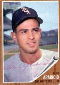
I played Little League baseball and was crazy about the sport. In our league, the teams were named after big league teams. Even though we lived in Baltimore, I played shortstop and second base for the Chicago White Sox. (The book on me: good glove/no bat).
At the time, Luis Aparicio and Nellie Fox played shortstop and second base for the real Chicago White Sox. They were my heroes. I knew everything about them, including the fact that they both weighed about 150 pounds in the pre-steroid era. I formed an emotional connection with the White Sox at the age of 10 or 11 and I still follow them.
My brand loyalty even rubbed off on the “other” team in Chicago, the Cubbies. Their shortstop was the incomparable Ernie Banks. I had heard of the Holy Trinity and I assumed that it was composed of Luis, Nellie, and Ernie.
I thought about all this when I opened the New York Times this morning and read about the nexus of Big Data, Big League Baseball, and Brand Development. Seth Stephens-Davidowitz has used big data to probe fan loyalty to various major league teams. (Unfortunately, he omits the White Sox).
Among other things, Stephens-Davidowitz looks at fans’ birth years and finds some interesting anomalies. For instance, an unusually large number of New York Mets fans were born in 1961 and 1978. Why would that be? Probably because boys born in those years were eight years old when the Mets won their two World Series championships. Impressionable eight-year-old boys formed emotional attachments that last a lifetime.
How much is World Series championship worth? Most brand valuations focus on how a championship affects seat, television, and auxiliary revenues. Stephens-Davidowitz argues that this approach fundamentally undervalues the brand because it omits the value of lifetime brand loyalty. When he recalculates the value with brand loyalty factored in, he concludes that “A championship season … is at least twice as valuable as we previously thought.”
What’s a brand worth? As I’ve noted elsewhere, it’s hard to measure precisely. But we form emotional attachments at very early ages and they last a very long time. As Stephens-Davidowitz concludes, “…data analysis makes it clear that fandom is highly influenced by events in our childhood. If something captures us in our formative years, it often has us hooked for life.”
My Social Media
![]()
![]()
![]()
![]()
