Strategy. Innovation. Brand.
Now You See It, But You Don’t
What don’t you see?
The problem with seeing is that you only see what you see. We may see something and try to make reasonable deductions from it. We assume that what we see is all there is. All too often, the assumption is completely erroneous. We wind up making decisions based on partial evidence. Our conclusions are wrong and, very often, consistently biased. We make the same mistake in the same way consistently over time.
As Daniel Kahneman has taught us: what you see isn’t all there is. We’ve seen one of his examples in the story of Steve. Kahneman present this description:
Steve is very shy and withdrawn, invariably helpful but with little interest in people or in the world of reality. A meek and tidy soul, he has a need for order and structure, and a passion for detail.
Kahneman then asks if it’s more likely that Steve is a farmer or a librarian?
If you read only what’s presented to you, you’ll most likely guess wrong. Kahneman wrote the description to fit our stereotype of a male librarian. But male farmers outnumber male librarians by a ratio of about 20:1. Statistically, it’s much more likely that Steve is a farmer. If you knew the base rate, you would guess Steve is a farmer.
We saw a similar example with World War II bombers. Allied bombers returned to base bearing any number of bullet holes. To determine where to place protective armor, analysts mapped out the bullet holes. The key question: which sections of the bomber were most likely to be struck? Those are probably good places to put the armor.
But the analysts only saw planes that survived. They didn’t see the planes that didn’t make it home. If they made their decision based only on the planes they saw, they would place the armor in spots where non-lethal hits occurred. Fortunately, they realized that certain spots were under-represented in their bullet hole inventory – spots around the engines. Bombers that were hit in the engines often didn’t make it home and, thus, weren’t available to see. By understanding what they didn’t see, analysts made the right choices.
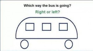
I like both of these examples but they’re somewhat abstract and removed from our day-to-day experience. So, how about a quick test of our abilities? In the illustration above, which way is the bus going?
Study the image for a while. I’ll post the answer soon.
Linearly Nonlinear

Take two!
If taking one vitamin pill per day is good for you, then taking two pills per day should be better, shouldn’t it? If two is better than one, then three should be better than two.
If we continue to follow this logic, we’ll soon be taking a whole bottle of vitamins every day. Why don’t we? Because of two limiting factors:
- Diminishing returns – each additional pill gives less benefit than the previous pill;
- Negative returns – beyond a certain point, each additional pill makes things worse.
It’s easy to figure this out for simple items like vitamin pills. But, in more complex decisions, we tend to have a linear bias. If there’s a linear relationship between two variables, we assume that the line continues forever.
Let’s take schools, for instance. In the United States, we’re obsessed with measuring student performance in schools and tracking it over time. We create performance tables to identify the schools that provide the best education and those that provide the worst.
You may notice that small schools are often at the top of the charts. You might conclude that school size and performance are linearly related. It might be wise to build more small schools and fewer large schools. Unfortunately, you’re suffering from linear bias.
To find the error, just look at the bottom of the performance charts. You’ll probably find many small schools there as well. Small schools dominate the top and bottom of the chart; large schools tend to fall into the middle range.
What’s going on? It’s the variability of small samples. If you flip a coin ten times, you might get eight tails. If you flip the same coin a thousand times, it’s very unlikely that you’ll get 800 tails. With larger samples, things tend to even out.
The same happens in schools. Larger schools have larger samples of students and their performance tends to even out. Performance in small schools is much more variable, both upward and downward. The relationship between school size and performance is a curve, not a straight line.
For the same reason, I was briefly (but gloriously) the most accurate shooter on my high school basketball team. After three games, I had taken only one shot, but I made it! In other words, I made 100% of my shots – the top of the performance chart. But what if I had missed that one shot? My accuracy would have fallen to 0%, the very bottom of the chart. With one flip of my wrist, I could have gone from best to worst. That’s the volatile variability of small samples.
A straight line is the simplest relationship one can find between two variables. I generally believe that simpler is better. But many relationships simply aren’t simple. They change in nonlinear ways. By trying to make them linear, we over-simplify and run the risk of significant mistakes. Here are two:
- If an hour of exercise is good for you, then two hours must be better. The assumption is that more exercise equals better health. It’s a linear relationship. But is it really? I have friends who exercise for hours a day. I worry for their health (and sanity).
- If cutting taxes by 10% is good for the economy, then cutting taxes by 20% must be better. We assume that lower taxes stimulate the economy in a linear fashion. But, at some point, we must get negative returns.
What’s the bottom line here? If someone argues that the relationship between two variables is a straight line, take it with a grain of salt. And if one grain of salt is good for you, then two grains should be better. And if two grains are better, then three grains … well, you get the picture.
(I adapted the school example from Jordan Ellenberg’s excellent new book, How Not To Be Wrong: The Power Of Mathematical Thinking).
Survivorship Bias

Protect the engines.
Are humans fundamentally biased in our thinking? Sure, we are. In fact, I’ve written about the 17 biases that consistently crop up in our thinking. (See here, here, here, and here). We’re biased because we follow rules of thumb (known as heuristics) that are right most of the time. But when they’re wrong, they’re wrong in consistent ways. It helps to be aware of our biases so we can correct for them.
I thought my list of 17 provided a complete accounting of our biases. But I was wrong. In fact, I was biased. I wanted a complete list so I jumped to the conclusion that my list was complete. I made a subtle mistake and assumed that I didn’t need to search any further. But, in fact, I should have continued my search.
The latest example I’ve discovered is called the survivorship bias. Though it’s new to me, it’s old hat to mathematicians. In fact, the example I’ll use is drawn from a nifty new book, How Not to Be Wrong: The Power of Mathematical Thinking by Jordan Ellenberg.
Ellenberg describes the problem of protecting military aircraft during World War II. If you add too much armor to a plane, it becomes a heavy, slow target. If you don’t add enough armor, even a minor scrape can destroy it. So what’s the right balance?
American military officers gathered data from aircraft as they returned from their missions. They wanted to know where the bullet holes were. They reasoned that they should place more armor in those areas where bullets were most likely to strike.
The officers measured bullet holes per square foot. Here’s what they found:
Engine 1.11 bullet holes per square foot
Fuel System 1.55
Fuselage 1.73
Rest of plane 1.8
Based on these data, it seems obvious that the fuselage is the weak point that needs to be reinforced. Fortunately, they took the data to the Statistical Research Group, a stellar collection of mathematicians organized in Manhattan specifically to study problems like these.
The SRG’s recommendation was simple: put more armor on the engines. Their recommendation was counter-intuitive to say the least. But here’s the general thrust of how they got there:
- In the confusion of air combat, bullets should strike almost randomly. Bullet holes should be more-or-less evenly distributed. The data show that the bullet holes are not evenly distributed. This is suspicious.
- The data were collected from aircraft that returned from their missions – the survivors. What if we included the non-survivors as well?
- There are fewer bullet holes on engines than one would expect. There are two possible explanations: 1) Bullets don’t strike engines for some unexplained reason, or; 2) Bullets that strike engines tend to destroy the airplane – they don’t return and are not included in the sample.
Clearly, the second explanation is more plausible. Conclusion: the engine is the weak point and needs more protection. The Army followed this recommendation and probably saved thousands of airmen’s lives.
It’s a colorful example but may seem distant form our everyday experiences. So, here’s another example from Ellenberg’s book. Let’s say we want to study the ten-year performance of a class of mutual funds. So, we select data from all the mutual funds in the category from 2004 as the starting point. Then we collect similar data from 2014 as the end point. We calculate the percentage growth and reach some conclusions. Perhaps we conclude that this is a good investment category.
What’s the error in our logic? We’ve left out the non-survivors – funds that existed in 2004 but shut down before 2014. If we include them, overall performance scores may decline significantly. Perhaps it’s not such a good investment after all.
What’s the lesson here? Don’t jump to conclusions. If you want to survive, remember to include the non-survivors.
My Social Media
![]()
![]()
![]()
![]()
